Book Cover Inspo
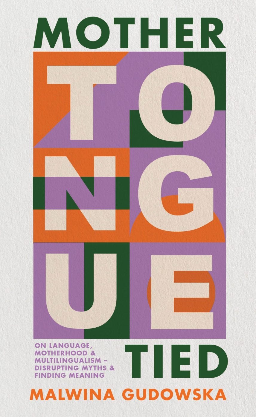
On the inspiration for the Mother Tongue Tied cover, Poland's art scene under political oppression & an early "tongue"
I am so grateful for all the words of support, congratulations, the shares on social media, and especially, the pre-orders after my book cover reveal last week. Thank you, thank you, thank you for making an otherwise supremely shitty week so much better. I will annoyingly remind you of pre-orders, and their importance for debut authors, a few more times before the book’s release on June 20th so bear with me. I promise you, this book has something for everyone, and I hope, will make you think of language differently in one way or another.
As promised, I want to share more about the book cover inspiration and the process, or at least my process as there are many different versions of this story depending on the author, the publisher, the book-selling market! Some of you asked if I had a say in the cover. Yes, absolutely! My editor asked me for my thoughts and some inspiration early on when I was still writing my first draft. This ask, especially as I had a long way to go to finish a draft, felt both exhilarating but also, daunting. It is not that I haven’t imagined my book, on a bookstore shelf before but I did not necessarily have a clear vision of what I wanted for the cover.
So, in response, I did what felt was the safest option: I offered some super bold and bright ideas and in total opposition, some super soft watercolour-inspired shapes. Looking back at the initial vision board for the cover, I realize the softer ideas were almost all inspired by the work of one of my favourite artists, authors and book designers, Leanne Shapton. (I contributed to her beautiful book Women in Clothes with Heidi Julavits and Sheila Heti and adore her work at the New York Review of Books).
I also sent my editor a list of things I was sure I did not want. Because this book is about language, motherhood, and multilingualism, sometimes all these things, sometimes one, with a few tangents in the mix, I did not want anything too language explicit: speech bubbles, lines representing communication channels, “thinking” images or outlines. Although I write about my mothering experience in the context of language, the book is about so much more than motherhood, so I also didn’t necessarily want an obvious motherhood or “mothering” image or illustration. But I did want the cover to have some sort of back story and personal meaning. And then, I remembered the Polish School of Posters.

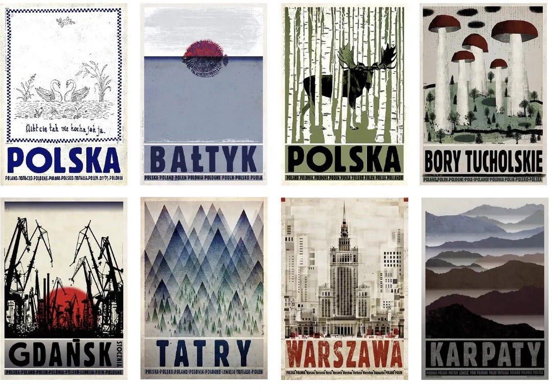
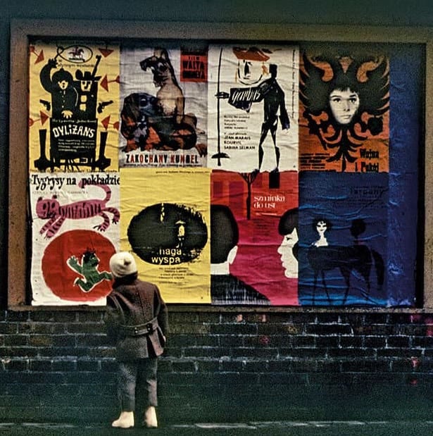
A post WWII anti-Soviet, anti-communist artistic movement, at its peak in the 1950s, 60s and 70s, the Polish School of Posters was a response to Poland’s situation at the time under heavy regulation, censorship and political oppression. After the war and under Soviet rule, movie, music, theatre, exhibition, and festival posters were the only permitted artistic outlets in Poland and the country’s best artists and designers contributed to the movement, creating works that were expressive and rich in metaphors, subversive thinking, symbolism, hidden meanings, and humour. The posters were meant to make people feel, to hope and to think critically and question everything—something I hope my book does as well.
But a book cover is hopefully also going to help sell a book (!) so this was something we talked a lot about with my editor and the sales and marketing team. Not long after I sent in my ideas, I got some cover options from the wonderful designer, Emma. I considered showing you these early incarnations here but have decided against it. I want the cover of Mother Tongue Tied to look exactly like it does in your head and not some other version. But I will share a first draft of this version, where there was more happening, the letters were more graphic and obscured but, in the end, we decided to tweak the letters to make it more clear as “tongue” and especially the “o” was almost too obscured in the first version. (The “o” in tongue is meaningful for me in many ways, perhaps a topic for another newsletter or something I can discuss when the book comes out!).

I promise, we will get back regular programming here soon with more “four things” and a discussion on some recent mom-blaming language studies. Thank you again for all your support!
But first, for my wonderful paid subscribers, a little perk, below, you will find images from the first vision board as well that first incarnation of this cover and some links to read more about the Polish School of Posters!
Now for those first images I sent my editor when she asked about cover ideas…
Keep reading with a 7-day free trial
Subscribe to Motherlingual to keep reading this post and get 7 days of free access to the full post archives.


